Improving the Colonist Trade System
Trading is an integral part of playing Colonist.io, and after listening to community feedback we are excited to share some significant improvements coming to the trade interface!
Our goal for improving the trade system is:
Redesign the trade system so it's easy to understand for all players. Make sure the new design allows for deeper choices in trade strategies.
We want to recreate it so that trading imitates the real-life Settlers of Catan board game and Catan Strategies. We also want to make it simple for an online multiplayer strategy game.
Problems with the Colonist Trade System
We gathered feedback from our players and identified 4 main issues:
- It's hard to tell when you are giving or receiving a resource.
- It's not clear how to trade with the bank.
- It’s not clear how to block trading with specific players, otherwise known as Embargo.
- Trade strategies are limited by the current counteroffers feature, not knowing how other players react to trades, and not being able to make open-ended trades.
We also have to make sure that our design can be implemented through all our expansion packs including City and Knights and Seafarers!
How to make it clear which resources you are offering or receiving
We explored more than 20 designs to find the best placements for different icons, resources, icons, arrows, and buttons. We wanted to make sure the design had intuitive mapping, so we didn’t want to rely on just text.
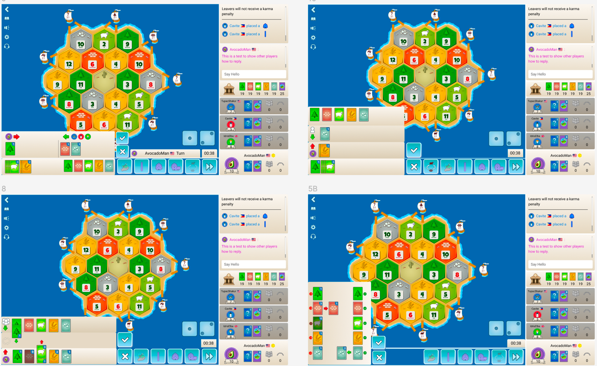
After conducting user tests with experienced and new players, we picked a design with three vertical sections. This makes the trading process more straightforward and easier to follow.
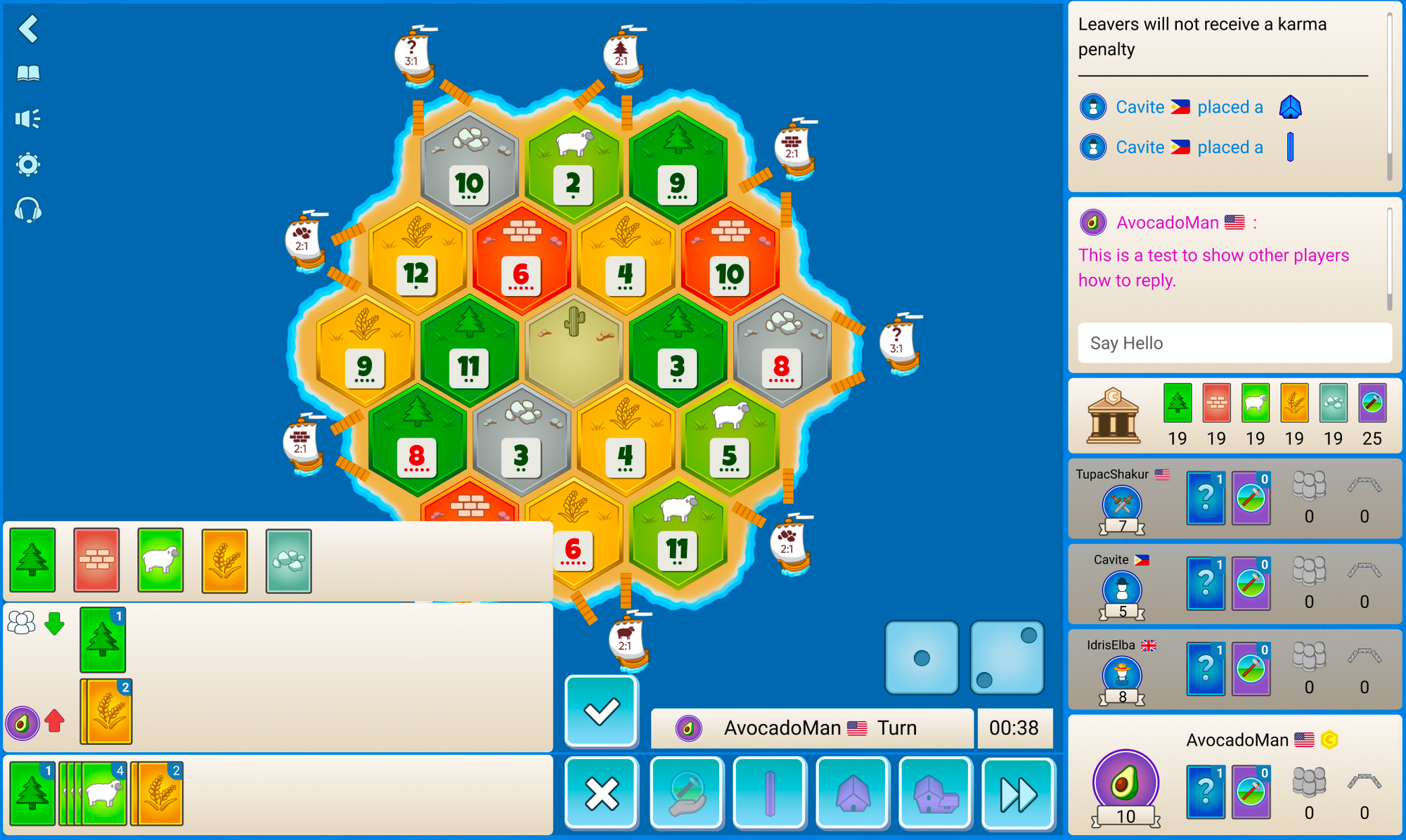
Similar to the original design, we kept the player's hand of resources unchanged as it is consistent in the interface.
We also moved the icons and arrows to the left-most side of the trade hub as it matches with the natural reading pattern of users who read from left to right.
The biggest change from our original design is that the exchange of resources go up and down instead left and right. What we found is that the upward and downward directions offer a more direct mental mapping of giving and receiving resources. Users can easily visualize them moving up and away from their hand, while receiving resources can be imagined as coming down toward their hand.
After settling on this design, we move on to our next problem…
How to Make Trade With the Bank Mechanism more Obvious?
We wanted to fix the issues players have with the bank, so we set some design goals:
- Players should be able to trade with the bank easily, even if they don't know how bank ratios work.
- Players should understand that the trade ratio shows how much of one resource they need to give to get a different resource.
- Trades should match the correct trade rates.
- Players should know the default bank trade rate is 4:1.
- Players should know how to trade with the ports.
Similarly, we created over 50 different designs to optimize how to show trade rates in an easy way while making the user experience simpler.
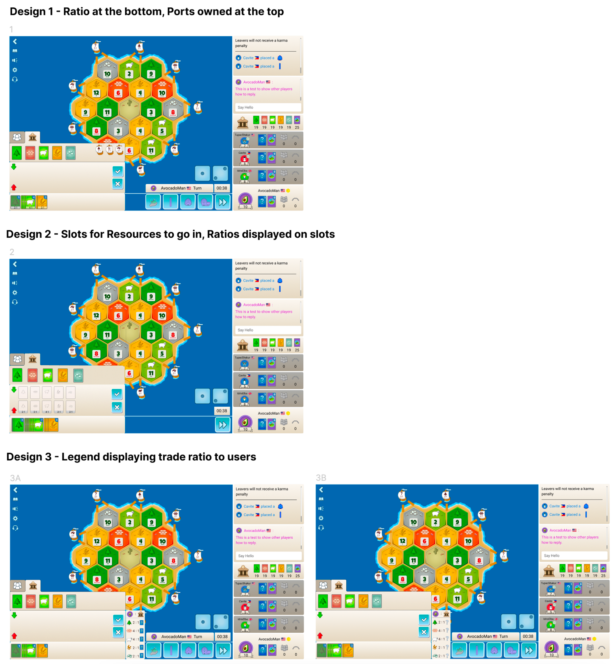
During our design tests, we found an important point…
When we show the trade rates under cards that users choose to get, it makes the experience confusing. This helped us learned a new rule for our future designs: we should not be putting trade rates there.
After testing and making about 10 iterations, we have the final design for trading with the bank. Here are some big changes we've made:
Bank Tab for Bank Trades Only. This makes it clear how to trade with the bank. It also lets users offer bank rates to other players. So, you can now offer 4 sheep to your opponents!
- Trade Rates on Cards in Your Hand. This is a better placement for trade rates. It makes it easy to understand that you "give two wood for one of anything.”
- Legend of All Trade Rates. If you have a port or no resources in your hand, you can still see all trade rates. This is helpful to check your trade rates. If you want, you can close this at any time with a button.
How to Block Trades with Other Players? (Embargo)
We got your complaints about embargoing, and we heard you! You can view the responses to our survey about the embargo function here.
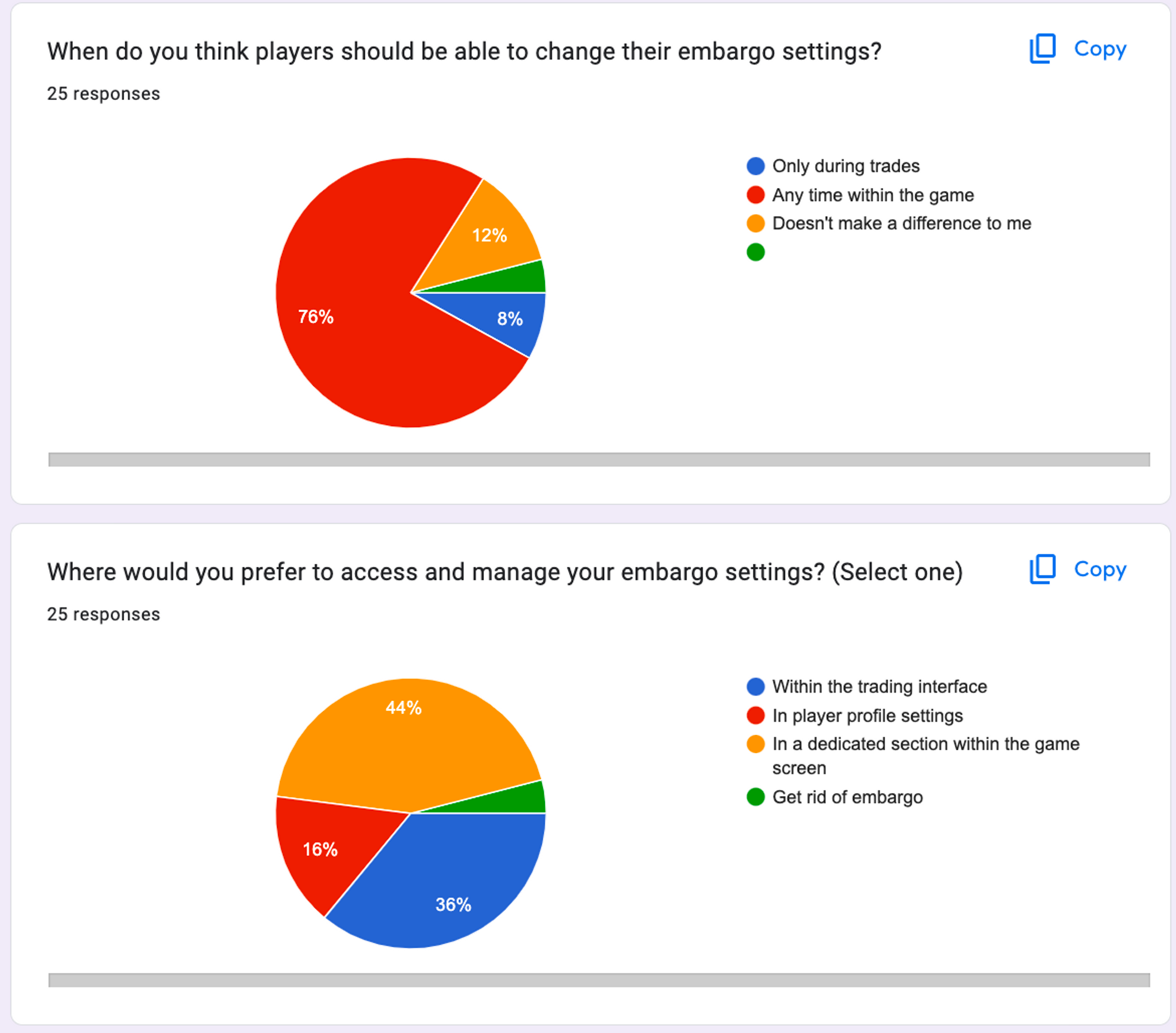
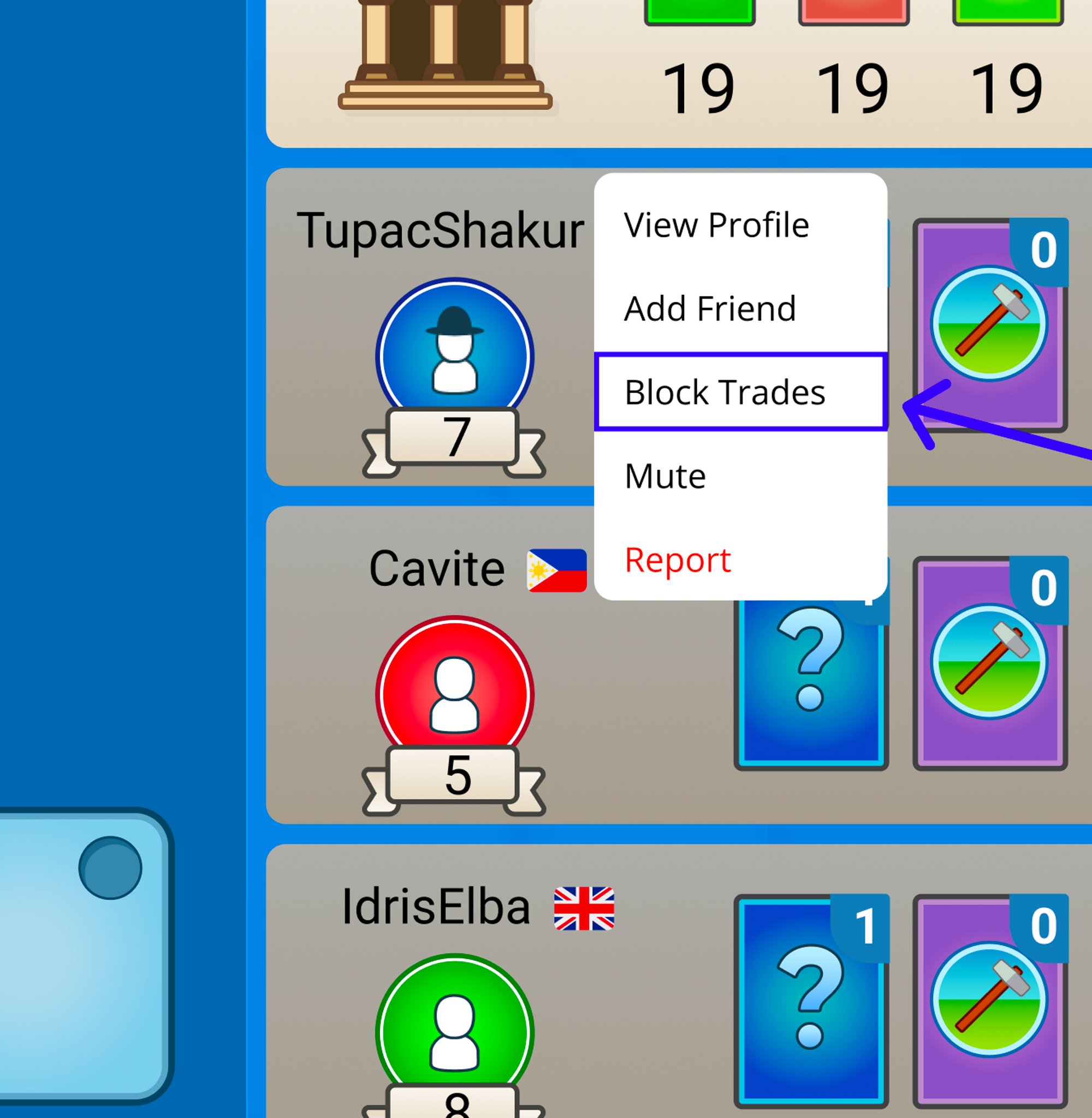
We decided to keep the embargo feature but put it in the player profile section. Now, you can access it at any time during the game, and new players are less likely to accidentally embargo other players.
How to Make Trading More Like Real Life?
We made three big changes to help our experienced players make more strategic trades...
- View opponents' responses to proposed trades
Similar to real life games, when somebody proposes a trade, we can hear other players say “no thanks” or “I accept.”
We’ve implemented this feature, by including the status icons of each player. You can now see which player accepts the trade, rejects the trade, or is waiting to respond.
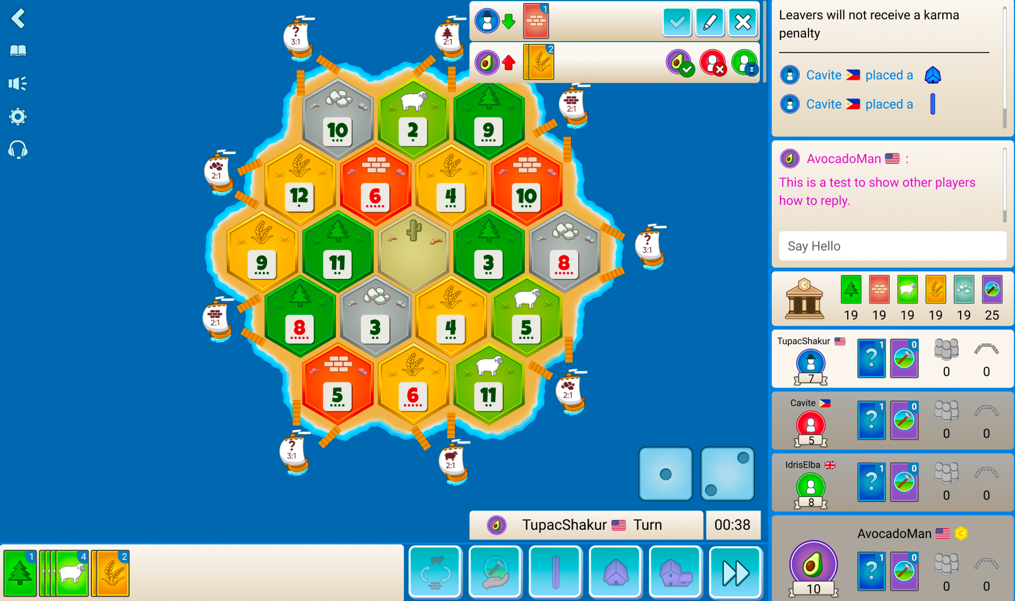
- Enable counteroffers even when you don’t have the resource
One big problem with trading in Colonist is when you can't suggest a trade because you don't have the specific resource someone wants. You might have a good trade offer for them, but you can't let them know! Now, we're letting players counteroffer trades for all trades. This way, players can say more about trades.
Another new feature is that we're letting players jump in on counteroffers. This is like in real life board games when you hear someone counteroffer a trade, you can say "I want that too!" and the player can choose to trade with you instead.
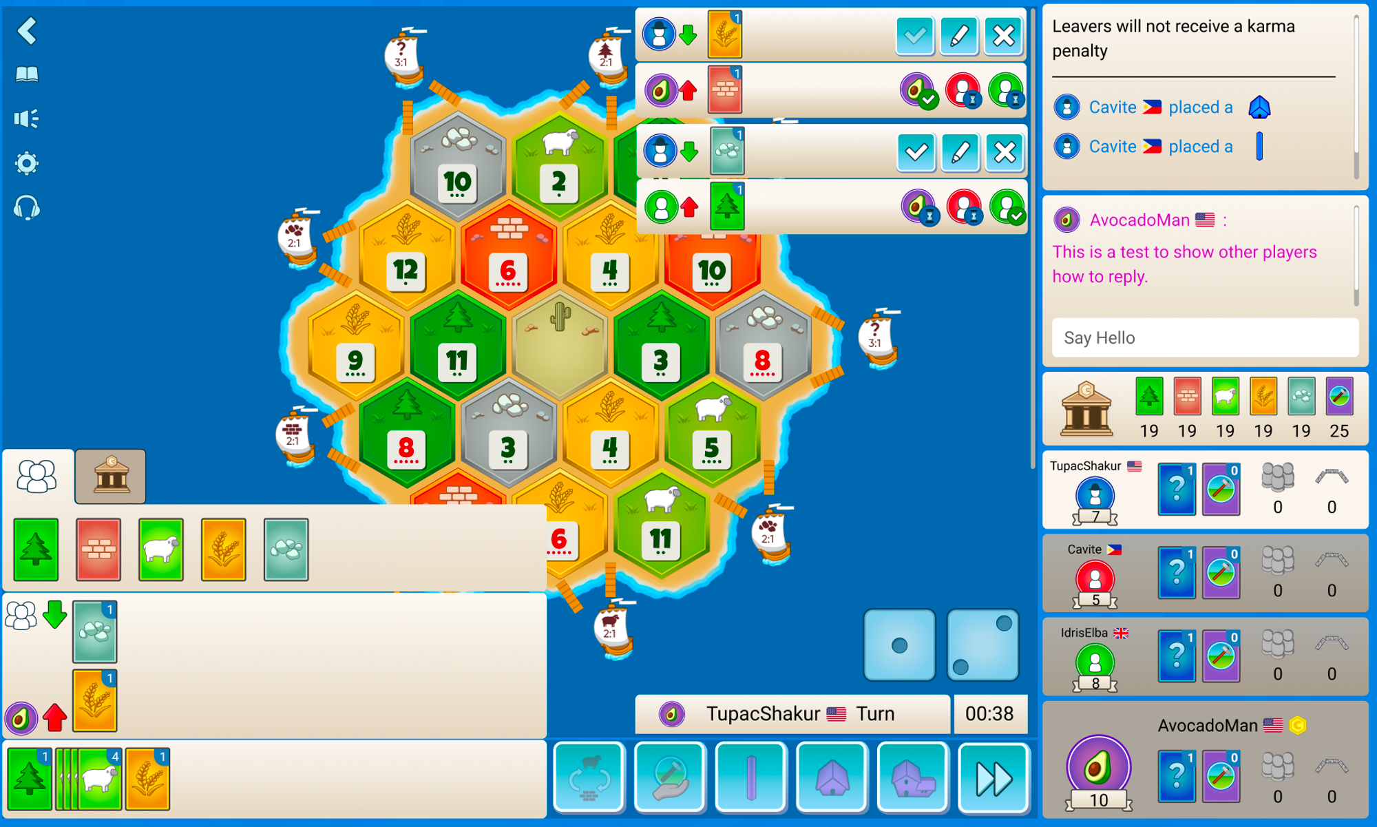
- Open-Ended Trading
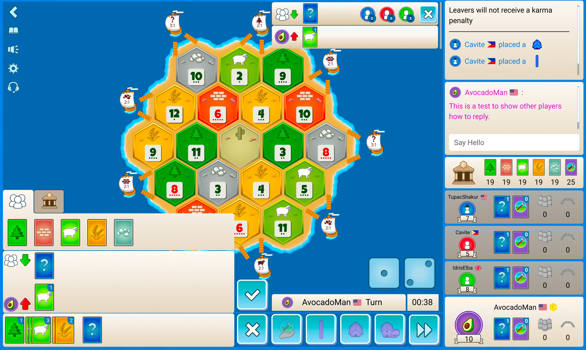
Finally, one of the biggest requests when it comes to trading is to allow open-ended offers or a “wildcard” trade.
This means you can make offers like “I can give one sheep for anything” or “I will offer anything for one sheep.” This makes trading more flexible and quick.
Our Results...
Of course, user feedback is the most important part of the redesign. After this implementation, we have been reading every single one of your suggestions and feedback. Many suggested that this redesign makes trading easier and more flexible for both new and experienced players. We tested each design at every stage to make sure it was the optimal design for a web game! You can see the summary of our results here.
For those of you looking to try out Catan online free or wanting to play Catan online, you're in for a treat with our new updates. So gather your Catan resources, prepare your Catan cards, and get ready to trade your way to victory.
These improvements were made based on your feedback, so continue to let us know what you think. We're all ears for any suggestions on improving the rules of Catan, optimizing the Catan map generator, or even a future Catan 3D edition.
User Feedback to Update the Design
As we slowly start to roll out the trade design, we are taking into consideration what you guys like and don’t like about it! The overall user experience is extremely important to us, and sometimes we need a bigger sample size. For example, we’ve updated the player and bank tabs to buttons after your feedback.
Current Updates:
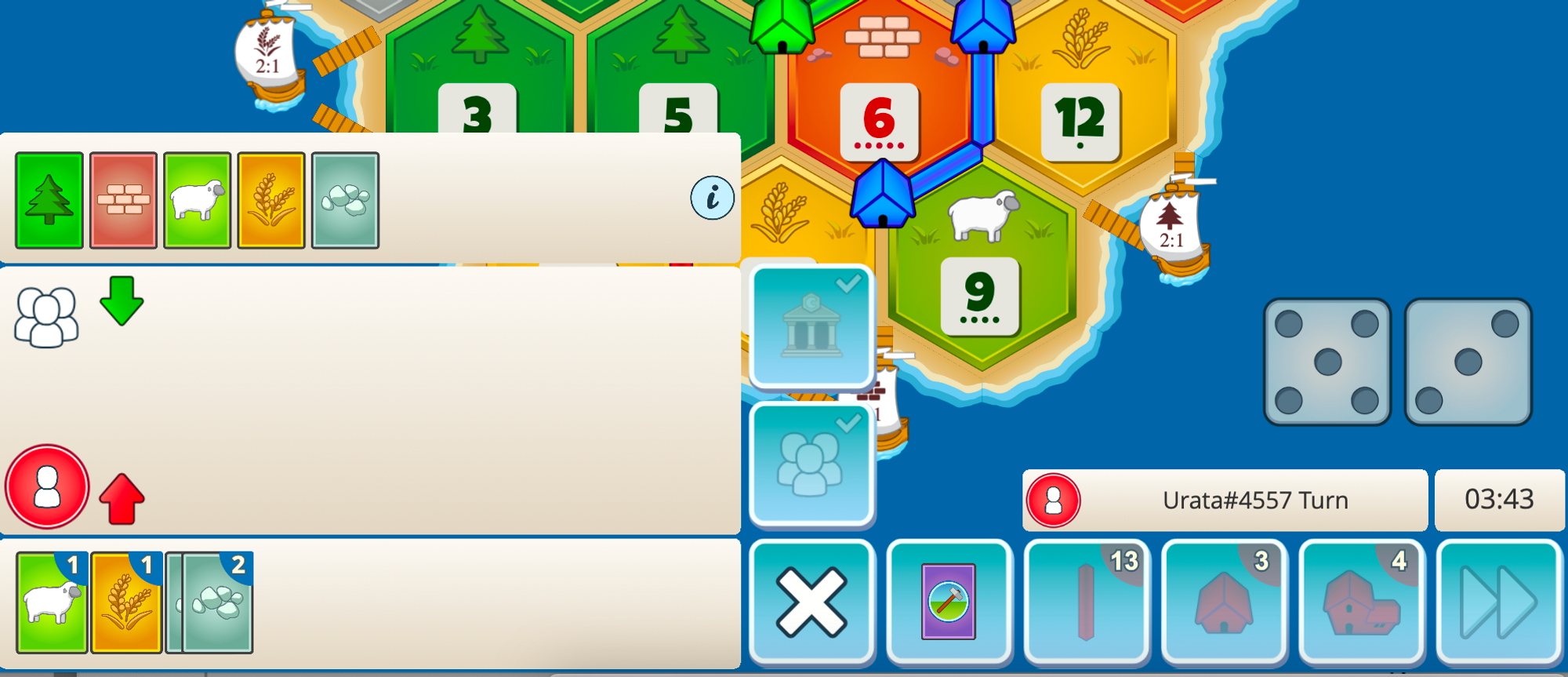
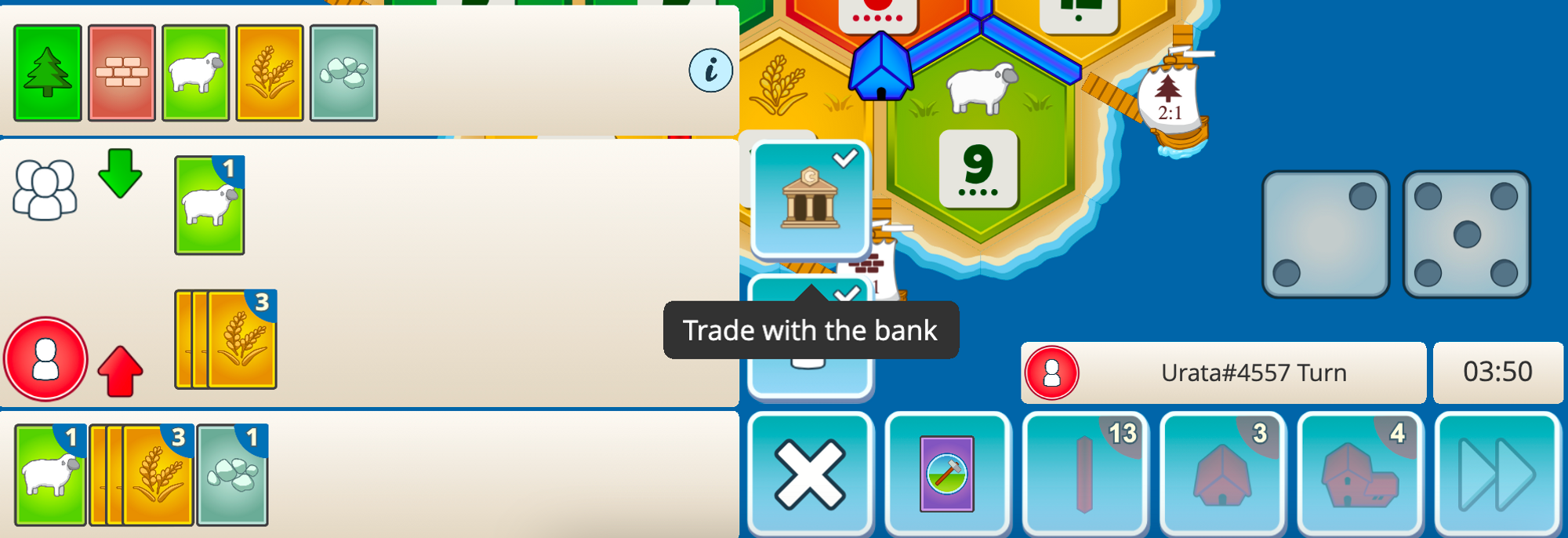
Feel free to participate in our Discord during this rollout to tell us what you like and don’t like! We’re constantly checking and hoping that this will create a much better experience for everyone!
